RUNERRA: ERRAND-SHARING APPLICATION
Runerra is an errand-running mobile app allowing “Runners” to notify users in their area when they’re heading to the store, and “Buyers” to join a run, add items to their shopping list, and set a budget for their order. Runerra aims to challenge the traditional delivery model while encouraging living communities like apartments, dorms and multi-roommate housing to develop bonds by helping each other out.
Runerra’s development team challenged us to increase the app’s clarity in three key areas. We were tasked with designing features that would better match user expectations, help Runerra demonstrate support for their users, and better keep users connected to ensure continued community engagement.
Solution:
A proposed set of seven new features essential to increasing clarity for the user that Runerra’s team could develop within the two months budgeted.
client:
Runerra (now Pikup)
methods:
Competitive Audit
Journey Mapping
Wireframing
Kano Analysis
Development Scoping
Rapid Prototyping
understanding the opportunity space
comparative analysis
To gain an understanding of existing delivery models and how Runerra’s approach challenges them, my team analyzed several similar applications, comparing features and functionality and highlighting ways Runerra could continue to distinguish itself in this space.
stakeholder interview
We then interviewed lead developers Ashley and Sam. Citing the need for increased clarity across the app, they gave us an in-depth walkthrough of Runerra’s current user demographic (mainly university students) and the app’s current functionality, challenges, and growth opportunities.
Stakeholder Interview: Getting to know Runerra with lead developers Ashley and Sam
mapping the user journey
In order to surface the difficulties and pain points Runerra users might encounter and to highlight opportunities for added clarity, I designed User Journey maps for both the Runner and Buyer roles. The map depicts each hypothetical user’s journey through use of the app, from initial discovery and awareness to continued use and endorsement to other potential users, charting interactions and emotional states at each step along the way.
feature ideation
Noting the pain points and opportunity areas surfaced through journey mapping, I made five rapid wireframes of features aiming to better match user expectations, to demonstrate support for Runerra users by clarifying unique functions, and to keep users connected by rewarding frequent use and making the app customizable.
REIMBURSEMENT CLARIFICATION
With Runerra, Runners front the purchase and receive payment from the Buyer upon completion of the run, a payment model that differs from other delivery services with which they are familiar.
To bring clarity to this unique reimbursement model, I recommended updated phrasing within the initial greeting slides prior to onboarding. An additional slide added prior to linking to Stripe and the user’s bank account clearly explains this payment flow to the user.
USERNAME
Most mobile applications allow customizable Usernames, an aspect of account registration that users have come to expect. For an added level of privacy and personalization and to better match user expectations, I recommended that Runerra provide the option to create a Username.
FAVORITE PLACES + MAP VIEW
Delivery apps commonly allow users to “favorite” places they frequently order from. They also generally offer a map view to help users find options nearby. I recommended following this convention by allowing users to add places to their ‘Favorites’ list, and by providing a searchable map view in the location selection window of the ‘start a run’ flow to make finding and selecting the desired destination easier.
SET GROUP AS PRIVATE + join by invite only
Most social media platforms allow the creation of private groups that must be joined via invitation, a convention that I recommended Runerra follow. Five roommates using Runerra might want the ability to make their group private so that they can control who can view and participate in their household runs.
RUN INVITE NOTIFICATION + OPT-OUT
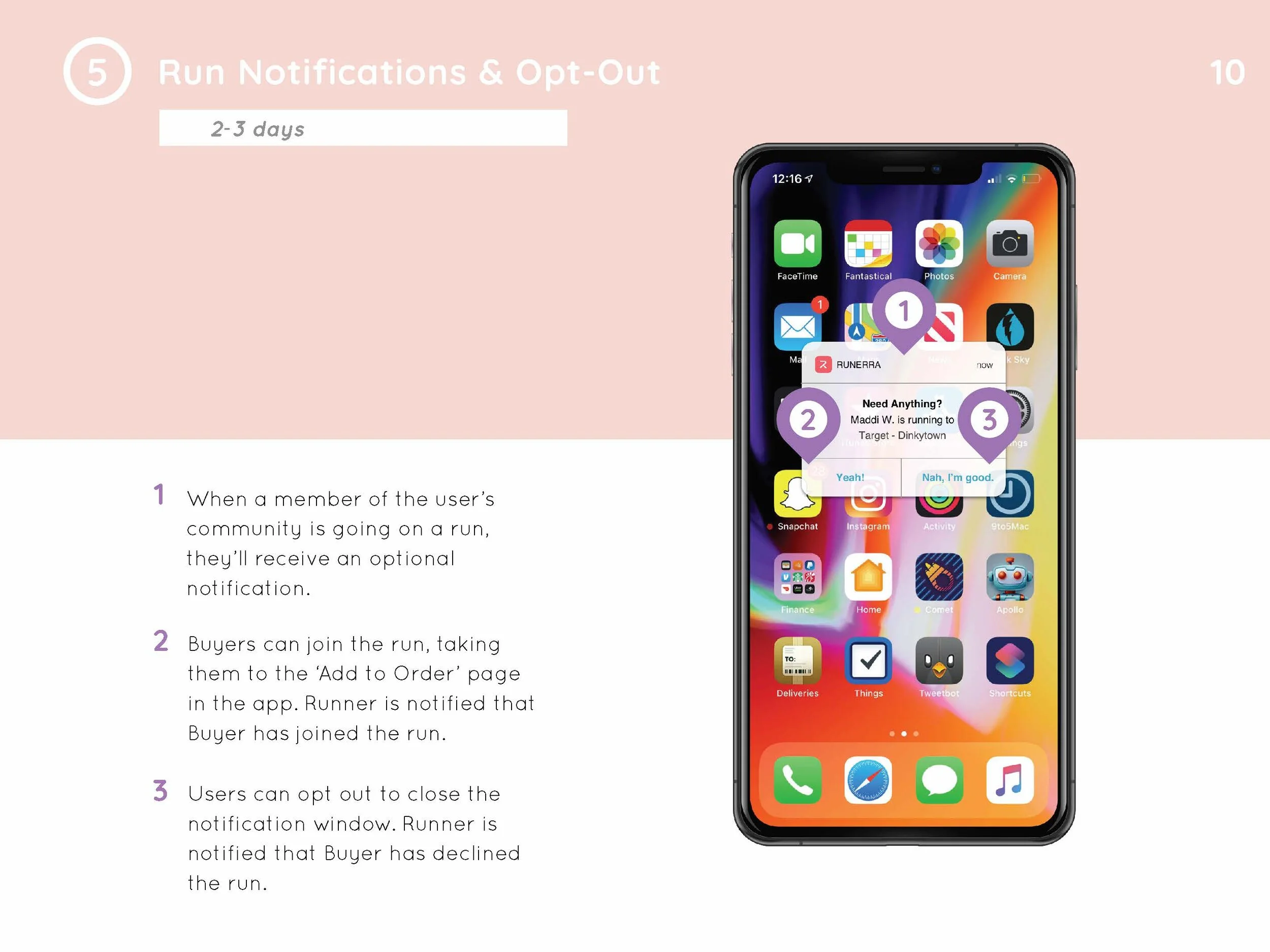
When a Runner begins a run, the app sends a push notification to those in their group. In order to streamline the Runner’s process and give them a definitive response, I recommend that Runerra provide an opportunity for group members to join or deny the run invite.
Our team selected eleven of the strongest features through a round of dot voting.
development scoping + feature selection
Lead developer Ashley returned to review our features. With each team member contributing five prototypes, nearly one hundred features were evaluated for feasibility and given a development time estimate. Through dot voting, the highest voted features were distributed in a Kano survey. Three of my proposals- Reimbursement Clarification, Favorite Places + Map View, and Run Invite Notification + Opt-Out- were included in the eleven features selected for a survey distributed to current and prospective users of the app.
Kano analysis of survey results.
kano survey + analysis
With the surveys complete, we began synthesis of our data using the Kano analysis method, separating user responses by their “current” or “prospective” status. Applying the Kano approach, we were able to analyze responses based on the degree to which users liked or disliked a feature and its level of importance. This gave us insight to the features users would find most useful and delightful. Considering the estimated scope of each proposal, our team moved into prototyping those key features that would best meet Runerra’s goals.
rapid prototyping + recommendations
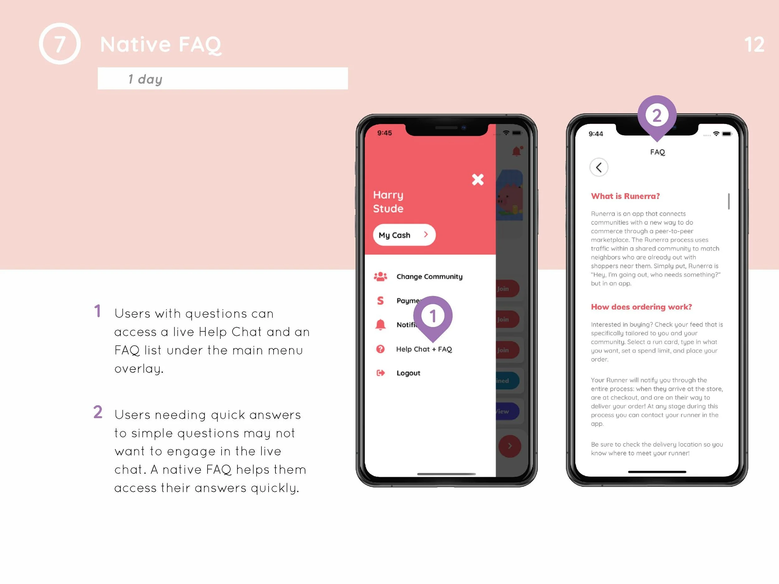
Leveraging existing and custom assets, I prototyped screens to demonstrate the seven most critical features that could be developed within Runerra’s budgeted time frame. Proposed features ranged from simple fixes (half a day of development) to far-reaching adjustments (four weeks of development) and are pictured below.
I then compiled my final recommendations and annotated prototypes into a report for hand off to Runerra’s team.
reflection
Soon after I presented my recommendations to Runerra’s team, the app was rebranded as Pikup.io. Working with Runerra, I learned the impermanent nature of digital products, the importance of designing for essential functionality, and just how crucial it is to keep the goals in mind.


